Build something impressive with the
Intarsia force-directed node diagram.
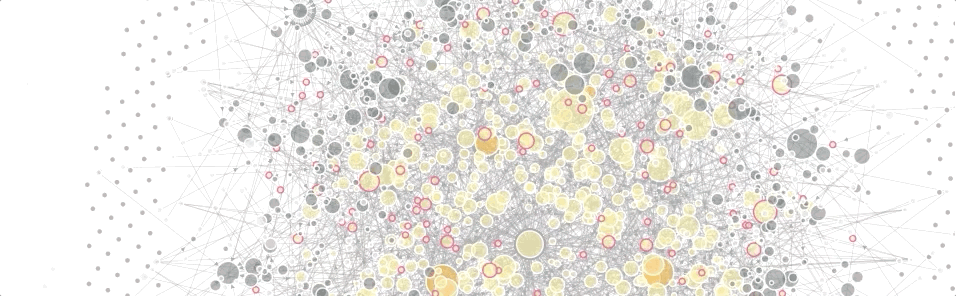
Tables are terrific, bar charts are beautiful, and line charts are lovely - but none of them will help you build a mental map of your web landscape. So we made something that does. Here’s how it works.

Every website is a circle.

Many websites are many circles.
Bigger dots have more traffic; smaller dots have less.

Filter to focus on what's important.

Lines are links.
For example, a portfolio might contain some vanity URLs. Those are linked to the sites they point to.

Dots can also be other things.
In this example, yellow dots are Google Analytics properties.
The graph is interactive.

When a site sends data to a GA property, the two are linked together.
The diagram organizes itself based on the forces of nature.

Instead of GA, sites can be linked to their GTM containers.
(GTM nodes are purple here.)
And instead of GTM, we can link to other types of nodes - media pixels or campaigns, for example.

Sites, GA, and GTM can all be shown at once.
Note the way that sites organize themselves around a central GTM container and GA Rollup property.
